Tuesday, April 22, 2014

And At That Moment I Swear We Were Infinite

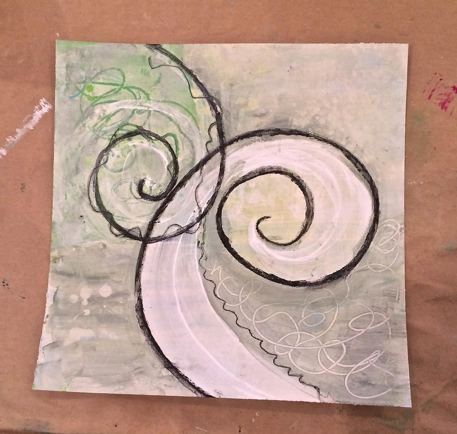
I painted this piece back in February.  I've dabbled in this design before with some auction donations, but had never done one I was able to keep.  Well, I am not really keeping it, but will be able to visit it.  It's for Sam who turns twenty-one next week.  Some of you new to me don't know of Sam, but many of you I've been friends with since she was a toddler and I was started to take my life into paper arts~rubber stamp art~mixed media~and more painterly pursuits.  It's been a long road and there have been many choices I made along the way that slowed down my journey and that took me out of the mainstream eye.  Regrets have surfaced from time to time but have been short-lived because the road to have Sam was also long yet held a smattering of miracles.


So here we are at the cusp of her adulthood (well, still some college and grad school) looking at a flower in full bloom.  She has so many years, experiences, challenges ahead (represented by the fullness of the flower's petals.)  The seventy or so French knots that make up the center of the flower are the moments I hope we are still able to have with her throughout the years.  The quote I added is one of her favorites that she introduced me to while in high school.  It quickly became one I really love because I can remember the feeling that Stephen Chbosky refers to from long ago.  It's hard to feel infinite in your fifties, but there are times when the three of us are together that I have a fleeting moment where I want it to go on forever.  But time doesn't stand still, so more changes are afoot as she travels on her journey and I meander on mine.

HAPPY ALMOST BIRTHDAY, SAM.


Thursday, April 17, 2014

Coming Up Daisies


It is finally spring here in Missouri (I am ignoring the freeze warning tonight) and I am delighted.  I was lucky enough to be teaching classes in Kansas City over the weekend and they are a bit ahead of us.  I was so excited to see the daffodils, tulip and Bradford pear trees in full blossom.  St. Louis will not be far behind so I am heading full force into spring with my art as well.  I lucked into some wonderful, inexpensive Birch cradled substrates on the way out of KC so I began today by painting the sides with black acrylic paint.  I then got out some supplies and wrapped my head around what I wanted to play with today.  A few months ago  I saw some alcohol ink painting techniques demoed at my local collage club so I decided to have my go at it.  That shaped the whole composition.  Pictured below are most of my supplies.


To begin, I cut a sheet of glossy cardstock to 3 5/8" x 3 5/8".  I dropped a dot of lettuce Adirondack alcohol ink in the bottom left corner and quickly blew the ink upwards.  As I guessed,  you have very little control so it created the haphazard grass that  I wanted.  However, it did make a thick 1/3" at the bottom with no variegation so I used a felt ink applicator and added some meadow by pouncing to make more texture at the bottom.


Once I was satisfied with the foliage , I used StazOn ink stamp the Seven Daisies stamp repeatedly across the page.  TRICK:  I used another paper to mask so  I could ink up a few at a time creating some more vertical highs and lows in the row.


Lyra Aquacolor crayons and a brush came next to give my field of daisies some color!  It is spring, you know.  MUST. HAVE. COLOR.

 
With the color bringing it to life, it was time to fill in the sky a little.  The one thing about white glossy is that it is in your face WHITE.  (RIGHT PHOTO) I started by being a little creative and adding a sun with one of Kae Pea's mid-century modern stamps, three rings. I love the versatility of Rubbermoon stamps.  After I inked it up with yellow Vivid, I partially wiped off the outer ring with a baby wipe (I liked the hint of it) and then used the corner of the stamp to add rays.  (LEFT PHOTO) Then I inked up her inksplat stamp, and began adding some light aqua into the sky.  Just because. 


The last composition steps were just for fun.  I added some champagne colored glass glitter to the center of each flower with gel medium and took the forgot me not stamp, masked it,  and added it into the foliage one word at a time so it could follow the path of the meadow ink.  


Once the embellishments were dry, I affixed the finished compositionto a piece of black glossy using Scor-tape. And then used that tape to affix to the birch 1" cradle panel.  (ALTERNATIVE: gel medium)  Using my micron .005 point, I added dots near the leaves and around the perimeter of the sun.  The result is a perfect gift for a hostess gift, to celebrate spring,  or even a for a May Day basket.  Mine is going to reside near my blooming orchids for the time being.


Thanks for joining me in my field of flowers.  You can see more of my art on my website and also on facebook at Nancy Curry Art


Friday, April 04, 2014

Chaotic Spring


March was such a busy month and April brings that promise, too.  It also brought more and more snow.  Enough, already!  Be gone..... So March was spring break for Sam.  She rested, relaxed, renewed, and we shopped.  It was a nice 10 days. 


When she left, Jim and I went to the Orchid Show and I took some pictures that would be fodder for the online iphoneography class I am taking by Susan Tuttle.   I am early in the lessons but have learned so much about the available apps...(many free) to use and yes, I am even trying my hand at self-portraiture, but I am much more comfortable photographing other things.


Art & Soul came quickly and I enjoyed my sojourn on the way to Overland Park.  I hit Dean & DeLuca's and two gift stores, Statements and Stick Sisters.  All three stops were wonderful.  I made my way to Art & Soul in Excelsior Springs for a couple of days.  I took two more classes by Jane Davies and one from Erin Keck that I got a "kick" out of. I had many partners in crime, but thoroughly enjoyed being next to Nancy Connelly for two out of three classes.  Not only is she my hero, but she is a delight in class, and truth be told, I was jealous of her wonderful prints.  This picture was taken before the green monster came out in me.  (Sandy Karsten was unknowingly photobombing in the background.) The retreat was well run and I definitely encourage anyone that can go to one of the Art & Souls to do it. 


Two out of three of my projects are WIP so just barely glance, but the third picture of the fabric flowers is of finished ones.  I had a ball with these.


Layers & Textures (WIP)                                            Stencils and Masks  (WIP)

Erin Keck's Shabby Chic Posies

From A & S at The Elms, I traveled back to Stampers Ink and did a demo full of some new offerings and revisted some from my book.  The event was well attended.  I walked in 20 minutes early to at least 15 sitting in their front seats, patiently waiting.  I hit the ground running and never stopped.  


Some samples highlighting the Mona Lisa Metal Powder capabilities. 

From Shawnee, I headed home and then headed back into sketching mode for some upcoming possibilities.  I did get to take a day off to see Rubbermoon's finest and longtime friend, Kristen Powers, last Sunday.  AND>>>>if you haven't seen my sneek peak yet, I picked up two plates of new stamps all ready for mayhem in the studio.  I head back to Stampers Ink next week for three terrific classes (mostly filled but check with the store) and will be bringing my new wares for their first public showing.  Then I get to hang out with Tanya, purveyor extraordinaire of the store, for the weekend.  It should be fun.  I love these classes, especially the advanced resist.  No one duplicates each other so the combinations are always amazing.  I'll take a couple of days off and work on my iphone pictures before prepping for my last class of the spring at For Keeps Sake called Transformations.  It's a class that opens up your eyes to a lot of organic possibility. 

So that catches everyone up on what I've been doing.  Or at least, all that I'll tell you about now!  Let's all hope that the spring hoopla I've been hearing about it here.  I'm ready.  Bring it.

Don't forget to like me on facebook @ Nancy Curry Art !!!! I'm also on Instagram as 2artsy. 

Monday, March 10, 2014

Tidbits


Well, it's almost mid March and hopefully the worst of winter is behind us.  I am sure I am not the only one who is ready.  I finished two new plates of stamps this week that I can't wait to use in the studio.  These include my first imagery that will work well to support the words and phrases that I included this go around.  I call the images, tidbits, since they are on the small side as most of my art is.  More to follow on them and the availability when I get the demo sets back.  I am just a wee bit excited.  The rest of March will be a blur.  Lots of artful gatherings here and one I am attending in a suburb of Kansas City with a group from my Collage Club. I am excited to be returning to Art & Soul for a couple of days and even more excited about doing a demo at Stamper's Ink on the 21st.  I then return home to finish off the month here.


Today I worked on an altered book spread for a collaboration in my club.  The theme of this month's book was zentangle art and I am the thirteenth one to work in it.  I seem to be Moon-obsessed since I chose the sun/moon bookends as my inspiration for my the alteration.  I began by gessoing the text on the right side (2 thin coats).  I decided to work the theme with a black stabilo pencil and Pitt Pen so I could have finite lines and ones that could be variegated.  There are several layers of Stabilo, applied wet and dry.  When the detailing was finished I applied one more layer of wet stabilo to the perimeter and watered it down enough to blur the edges with pools of gray.  I also used more stabilo in the interior to create shadows in the emptier white areas.  I am pleased with the result of my explorations and would definitely work this way again.

UPCOMING CLASSES:

March 21:                Stamper's Ink:    FREE DEMO   11:30 AM
April 11-12:             Stamper's Ink:    Three classes.  For samples and descriptions click here.
April 26:                  For Keeps Sake: Transformations  10:00 AM- 1 PM

Thursday, February 20, 2014

Wanderlust


 Round and Round we go........where we'll stop nobody knows.


This is a whimsical project that stemmed from being cooped up with two standard poodles for a couple of weeks because of the snow.  I have WANDERLUST.  I was so excited when my good friend, Barb Rogers, dreamed up that stamp for Rubbermoon.  I couldn't wait to use it.  Who doesn't get wanderlust? Now, usually it means something a little more exciting than actually taking two dogs on their first walk in my subdivision for ages, but today it was just that. It was so exciting to watch sidewalks reappear this afternoon due to the melting snow and spring-like temperatures.  So I guess I had local wanderlust.  But I do have it for longer trips. too.  More on that later.

Wave hi to my inspirations, Angus and Tucker.


Today's walk provided the inspiration for the scenic nature of the tumbler.  As you can tell, my dogs are poodles so don't look anything like Sunny Carvalho's, but I was dying to use several of her brand new stamps so I went with a whimsical scenic extravaganza.  

I amassed some supplies including a photo insert double walled tumbler that I stockpile from Starbuck's, some Golden Fluid Acrylics, Adirondack Dye Ink pads (Stream, Bottle, Meadow, Butterscotch, Denim), Ranger Clear Resist (recently renamed as Ranger Watermark Resist Ink), Ranger Perfect Medium pen, cosmetic sponges, thin liner paintbrushes, Perfect Paper Adhesive, glossy (non-photo) paper, and an assortment of Rubbermoon stamps.


*******Linked list of those stamps to follow below.


The first step was to use the paper found inside the tumbler as a template.  I drew around it and cut it out. 


Once cut out, I planned my scenery by setting out some many of the stamps.  I left them there as I began the resist stamping.  I used several of Kae Pea's Mid Century Moderns as well as some of the  square stencils she designed for StencilGirl, and randomly placed them throughout the scene.  It does not show up well in the photo since it is clear, but you can see the lower border I stamped if you look closely.  Don't worry--all will be revealed. 
                                                                                                                                                                                                                

I used the Perfect Medium pen to add some grass detail that would become ground level for my scene.


If you are familiar with my book,  Texture Effects for Rubber Stamping, this process took up the whole first chapter.  I allowed the resist ink to dry for about 15 minutes and then took one cosmetic sponge and alternated coloring in a circular manner with ELBOW GREASE, to bring out the resist ink. In the next photo, you will see the result. 


Once this dried in a few minutes, I added another layer of the same colors to make the color transitions a little smoother.  That can also be achieved by adding some brown in various areas to unite the color, but in this piece I wanted the colors to stay vibrant.  I did a lot of air drying for this project but you can heat to dry for about 10 seconds to hurry the process.

I then began the stamping process using the same inks that were already used and the addition of an Espresso Adirondack pad.  Many times I add detail to the resist with a reverse stamp, or by off-setting with the same stamp.  I started my stamping by doing that in the background and border. I repeated that concept with the stencil again as well.


Stamp List in Detail:

Lil Flower 1
Lil Flower 2
Sunflower
Lucy Bird
Beg Your Pardon
Linear
Three Rings
Mod Marks Dark
Mod Marks Light
Geo-Metric
Light Crescent
Inksplat
3 Story Home
Musical Notes
Forget Me Not
To the Moon & Back
Be Mine
Joy
Wanderlust (available at Rubbermoon, but too new to be online)
Star Tree
Braided Circle

Detailing the resist grass was a little more challenging but doable.  I wet a liner brush and drug it through my Bottle inkpad and drew grass.  (sorry for the lousy lighting).  I then put a drop of Titan Buff, Quinacridone Magenta, ,Bronze Golden Fluid Acrylic on my palette and began adding some "noise" throughout the grass area, highlighted some stars, the moon, the house, etc.  This is my favorite part, believe it or not.


I decided I wanted to add some more depth so I stamped the musical note background in meadow onto some of the leftover glossy. I loved that the pad was so juicy that there was extra ink on the solid part of the background. I stamped, separated by line, and outlined in black the Moon and Back stamp and affixed it to the glossy with matte Perfect Paper Adhesive.  I then handcut and outlined three hearts and affixed them just above the dog.  I hand drew balloon markings and strings to atttach the balloons to the leash. 


To finish this tumbler off, I outlined the perimeter with a black Sharpie and signed. I chose to spray two light coats with a Krylon UV Resistant Sealer to keep the colors sharp. 

Here it is in totality--flat.  There's a lot going on in it, for sure!  It changes, though, once it is in the tumbler because the circular shape allows the eye just to see parts and it becomes just enough for my eye.  


To place in the tumbler, just roll it up similar to the inner barrel and slowly push it in.  It will naturally expand once it reaches the top.  Screw the bottom of the tumbler back on. I handwash the tumblers I've done for myself and they still look fresh and brand new.  Make yourself one.  It will make you smile all day.

       AND YOU THOUGHT THAT WAS THE END??????? 

BONUS:  Here's my mainstay personal one that is 6-7 years old and used frequently:
(Angus photobombed the third picture that I took in my powder room in pitch black. I had no idea he was there until the flash delay occurred.  I had to leave it in.  He's such a ham.)


 And finally.......


THE END

Sunday, January 26, 2014

Retro January Part 2

I spent some time a couple of weeks ago looking back at altered calendars of Januarys from years past.  Today, I pulled out some more and revisited them again.  Again, it is interesting to see what I was doing ten years ago in these collaborations.  Today I revisit 2004 and 2005.  The 2005 calendar base was Mark Rothko and the 2004 was a magnetic calendar with no particular theme.


I was quite taken with the juke box in the picture above.  So much so that I made it the focal point of that page and took a stroll down memory lane with what songs I would put in it.

Harlequin pattern still remains a favorite of mine as are chalk inks.  


A mish mash page that also includes some cold weather art by Sam who was 10 at the time.


 It's fun to see my old Christmas cards again. 


As always, water media dominated a lot of artwork I would focus on.  

 Hearts anyone?


Gymnastics was a part of every January for many years. I'm glad now that it's over that I documented the good, the bad, and the ugly.  It's a lot easier to look back on it now.  Thanks for looking with me.